
How to Optimize Custom Medical Website Design for Mobile Devices?
Are you a medical professional looking to optimize your custom website design for mobile devices? In today’s digital age, it’s crucial that your online presence is compatible with mobile platforms, as more and more people rely on their smartphones and tablets for accessing information.
In this guide, we will walk you through the step-by-step process of optimizing your custom healthcare website design Jacksonville for mobile devices. By following these guidelines, you’ll ensure that your website is mobile-friendly, allowing patients and potential clients to easily navigate and access it on their mobile devices. So, let’s get started and make your website mobile-ready!
Quick Tips
- Optimize your medical website for mobile devices by using a responsive design. This means that your website will automatically adjust and look good on any screen size, whether it’s a smartphone or tablet.
- Make sure your website loads quickly on mobile devices. Slow loading times can frustrate users and lead them to leave your website. To improve loading speed, compress your images and minimize the use of large files.
- Keep your medical website’s design simple and clutter-free. Mobile screens are smaller, so it’s important to prioritize the most important information and make it easy for users to navigate. Use clear headings and a clean layout to enhance readability.
- Don’t forget about touch-friendly navigation. Instead of relying on small buttons, use large, easily clickable elements to facilitate smooth navigation on mobile devices. Incorporate features like drop-down menus or swipe gestures for an intuitive user experience.
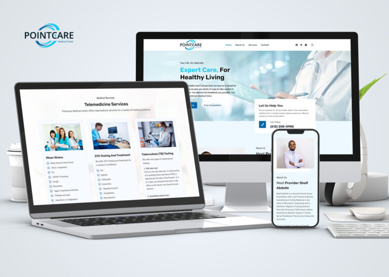
Prioritize responsive design to ensure a seamless mobile browsing experience
Mobile responsiveness
Responsive design is crucial for ensuring a seamless mobile browsing experience. To prioritize responsive design, start by auditing your medical website design to identify any design elements or features that may hinder mobile browsing. Remove or modify anything that may cause readability or usability issues on smaller screens.
Simplify your navigation menu and make sure buttons and links are easily clickable with a finger. Additionally, optimize images and videos to load quickly on mobile devices. By following these steps, you can create a responsive design that provides a user-friendly experience for your mobile visitors.
Mobile-first approach
Next, focus on designing your medical website with a mobile-first approach. This means considering the needs and limitations of mobile users before those of desktop users. Start by determining the most important content and functionalities for mobile users, and prioritizing them accordingly.
Use a clear and concise layout that eliminates clutter and prioritizes important information. Consider incorporating a grid layout that adapts to different screen sizes, ensuring that your content always fits properly on any device. By adopting a mobile-first approach, you can create a website that is optimized for mobile users and provides a seamless browsing experience.
Test
Lastly, test your medical website design on various mobile devices and screen sizes to ensure that it functions properly and looks good on all platforms. Invest in responsive design testing tools or use browser developer tools to simulate different mobile devices. Pay attention to how your website loads, how quickly it responds to user interactions, and how the content adjusts to different screen resolutions. Fix any issues that arise during testing to ensure a smooth and enjoyable mobile browsing experience for your visitors. By regularly testing your website on mobile devices, you can stay updated with the latest design trends and technologies, providing an exceptional mobile experience for your users.
It is essential to prioritize responsive design in order to ensure a seamless mobile browsing experience. By auditing your website, adopting a mobile-first approach, and testing your design on various devices, you can create a user-friendly medical website design that functions flawlessly on mobile devices. So, go ahead and make a responsive design your top priority to keep your mobile users happy and engaged.
Optimize page loading speed for quicker mobile access to information
Compress images and videos
When trying to access information on your mobile device, it can be frustrating to wait for a slow-loading webpage. That’s why it’s important to optimize the page loading speed for quicker mobile access. One way to do this is by compressing images and videos. By reducing the file size of these media elements, you can significantly improve the loading time of your webpage. Additionally, you can enable browser caching, which stores certain elements of your website on the user’s device. This allows the page to load quicker upon returning to it, as the browser doesn’t need to download all the data again.
JavaScript and CSS files
Another helpful tip to optimize page loading speed for mobile access is to minimize the use of JavaScript and CSS files. These files can add weight to your webpage and slow down its loading time. If possible, combine multiple JavaScript and CSS files into one, reducing the number of requests the browser needs to make. You can also consider minifying these files, which removes unnecessary white spaces and comments, further reducing their size. By minimizing the use of JavaScript and CSS files, you can make your webpage lighter and faster to load on mobile devices.
Content Delivery Network (CDN)
Lastly, consider using a content delivery network (CDN) to optimize the loading speed of your webpage. A CDN is a network of servers distributed across different locations worldwide. When a user accesses your website on their mobile device, the CDN identifies their location and serves the webpage from the server closest to them. This reduces the distance the data needs to travel, resulting in faster loading times. By utilizing a CDN, you can ensure that your mobile users can access information on your website quickly and efficiently.
For faster access to information, optimizing the speed of page loading is crucial to providing a smooth and efficient mobile experience. By compressing images and videos, minimizing the use of JavaScript and CSS files, and utilizing a content delivery network, you can improve the loading time of your webpage on mobile devices. So why wait? Start implementing these optimization techniques today and provide your mobile users with the fast and seamless access they deserve.
Develop user-friendly navigation with clear menu options and search functionality
User-friendly navigation
Having user-friendly navigation on your medical website design is crucial to ensuring a positive user experience. To develop such navigation, start by creating clear and concise menu options. Organize your menu items logically and prioritize important pages at the top. This will make it easy for users to find what they are looking for without having to click through multiple menus. Additionally, include search functionality on your website to further enhance navigation. This will allow users to directly search for specific content and quickly access the information they need.
Terms and language
When designing your menu options, think about what your users would be looking for and how they would navigate your website. Place yourself in their shoes and determine the most intuitive and logical way to organize the menu items. Avoid using complex terminology or jargon that may confuse your users. Use clear and simple language that is easily understandable, particularly for those with lower reading levels.
Search function
Incorporating search functionality into your website is another important aspect of user-friendly navigation. This allows users to bypass navigating through menus and directly search for what they need. Make sure to place the search bar in a prominent location, such as at the top of your website, and use a recognizable magnifying glass icon to signify its purpose. Additionally, make the search bar responsive and provide auto-suggestions to help users find what they are looking for faster.
By developing user-friendly navigation with clear menu options and search functionality, you can enhance the user experience on your website. By organizing your menu items logically and using clear language, users can easily find the information they need. The inclusion of a search bar further streamlines navigation, allowing users to quickly access specific content. Aim to create a website that is intuitive and user-centered, ensuring a positive experience for all your visitors.
Ensure legibility by using appropriate font sizes and formatting on mobile screens
To make your mobile content highly readable, it’s crucial to make sure that your font size and formatting are appropriate. By using appropriate font sizes and formatting, you can greatly improve the readability of your mobile content. To start, make sure to choose a font size that is large enough to be easily read on a smaller screen. A font size of 14 pixels or larger is generally recommended for body text on mobile devices. Additionally, consider using a sans-serif font for improved legibility, as these fonts are often clearer and easier to read on screens.
In addition to font size, formatting plays a crucial role in enhancing legibility on mobile screens. When formatting your content, make use of headings and subheadings to break up your text and make it easier to scan. By using headings, you provide visual cues for readers, making it easier for them to find the information they are looking for. Additionally, consider using bullet points or numbered lists to present information in a concise and organized manner. Breaking your content into smaller, digestible chunks helps prevent information overload and improves the overall readability of your mobile content.
Furthermore, it is important to consider the spacing and line height of your text. Adequate spacing between lines and paragraphs improves legibility by providing enough breathing room for readers to comfortably navigate through your content. Aim for a line height of 1.5 or more, which helps prevent the text from looking cramped and allows for easier reading. Additionally, make sure to use appropriate line length, limiting the number of characters per line to around 50-75 for optimal readability. By following these tips and ensuring appropriate font sizes and formatting, you can greatly enhance the legibility of your content on mobile screens, improving the overall user experience.
Conclusion
The importance of optimizing a medical website for mobile devices cannot be overstated when it comes to ensuring a seamless browsing experience for users and improving their accessibility to information.
By prioritizing responsive design, website owners can ensure that their sites adapt to different mobile screen sizes and orientations, guaranteeing a consistent user experience. Moreover, optimizing page loading speed allows users to quickly access the information they need, enhancing convenience and satisfaction.
Additionally, developing user-friendly navigation with clear menu options and search functionality promotes ease of use, enabling users to find the desired content efficiently. By implementing these strategies, medical websites can make a significant impact on the reader’s life, providing them with a valuable resource that is readily accessible and easy to navigate, ultimately improving their overall healthcare experience.
FAQ
Q: Why is it important to optimize a custom medical website design for mobile devices?
A: Optimizing a medical website design for mobile devices is crucial because the majority of internet users now access the web through their mobile phones or tablets. By optimizing for mobile devices, you provide a better user experience, retain visitors, and increase the chances of converting them into patients.
Q: What are the key factors to consider when optimizing a medical website design for mobile devices?
A: Some of the key factors to consider include responsive design, fast loading times, mobile-friendly navigation, legible text and images, thumb-friendly buttons, clear call-to-action buttons, and compatibility with various mobile devices and screen sizes.
Q: How does responsive design contribute to mobile optimization?
A: Responsive design ensures that your medical website adapts automatically to different screen sizes, resolutions, and orientations. It allows the content and layout to adjust smoothly based on the device being used, providing users with an optimal viewing experience, regardless of the screen size they are using.
Q: How can I improve the loading speed of my medical website on mobile devices?
A: To enhance loading speed, consider optimization techniques such as compressing images without compromising quality, minimizing the use of heavy multimedia elements, leveraging browser caching, and using a content delivery network (CDN) to reduce server response time.
Q: Why is mobile-friendly navigation important, and what should I consider when designing it?
A: Mobile-friendly navigation simplifies the browsing experience for users on mobile devices. Key considerations include a clear and easily accessible menu, a hierarchical structure, the use of drop-down menus sparingly, visible search functionality, and the ability to return to the homepage easily.
Q: How should I adjust the text and image sizes for mobile optimization?
A: Text should be legible without requiring users to zoom in unnecessarily. Ensure that font sizes are large enough for easy reading, and consider using a mobile-first approach when designing the content layout. Images should be appropriately sized and compressed to improve loading speed while maintaining quality.
Q: What are thumb-friendly buttons, and why are they important for mobile optimization?
A: Thumb-friendly buttons are buttons that are large enough to be easily tapped with a thumb or finger. By making buttons easier to click, you enhance the user experience and minimize frustrating misclicks. Consider designing buttons with a minimum size of 44 x 44 pixels.
Q: Why do clear call-to-action buttons matter for mobile optimization?
A: Clear call-to-action buttons guide users towards taking specific actions, such as scheduling an appointment or contacting your medical practice. By making these buttons visually prominent, easily identifiable, and accessible, you create a seamless pathway to patient engagement and conversions.
Q: How should I ensure compatibility with various mobile devices and screen sizes?
A: It is essential to test your custom medical website design across multiple devices and screen sizes to ensure compatibility. Consider using responsive design frameworks, using industry-standard media queries, and leveraging testing tools to guarantee that your website looks and functions consistently across various devices.
Q: Should I consider hiring a professional web designer to optimize my medical website for mobile devices?
A: Hiring a professional web designer with expertise in mobile optimization can be highly beneficial. They can ensure that your website is optimized effectively, provide guidance on best practices, and save you time and effort in the long run.