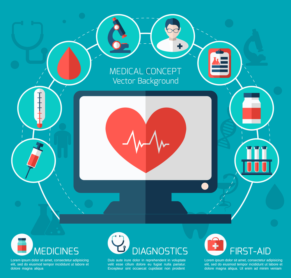
The Psychology Behind the Best Color Schemes for Medical Websites
Let’s start with something simple: people decide how they feel about a website within seconds. Maybe even less. That decision happens before they read your headline, before they scan your services, before they even notice your logo. It’s visual first. And that’s exactly why your color palette isn’t just decoration, it’s a foundational part of your healthcare website design. If you’re managing a medical practice, launching a wellness center, or running marketing for a larger healthcare group in Jacksonville or beyond, it’s worth pausing to ask: What is your color scheme saying to new patients? This post breaks down the psychology behind the best color schemes for medical websites. No fluff. Just real, evidence-backed insights into how color, user experience, and brand identity intersect to influence trust, perception, and even conversion.
Why Color Psychology Matters in Healthcare Website Design
In healthcare, color does more than just set a tone. It creates emotional cues. It builds trust. It can even reduce anxiety, or increase it.
For example, blue is probably the most common color in medical web designs. Why? Because it’s strongly associated with trust, cleanliness, and competence. Not just in theory, either. According to a survey conducted by Adobe, blue consistently ranked highest in terms of consumer trust across industries.
Compare that to red, which signals urgency and danger. It works for ERs or urgent care clinics, but it can feel a little intense on a general wellness site or pediatric platform. Then there’s green. Green suggests calm, balance, and renewal—a perfect fit for wellness centers, medical spas, and meditation platforms.
But it’s not just the colors themselves. It’s how they’re used. Surrounding a CTA with the right contrast. Choosing background colors that reduce eye strain. Pairing tones to support the emotional flow of your content structure. That’s where psychology meets practice.
What the Data Actually Says About Colors That Convert
We looked at several eye-tracking and UX studies to better understand how website color palettes affect user interaction. Here’s what stood out:
- High-contrast CTAs (like blue on white or green on gray) consistently get more clicks.
- Websites using soft, cool tones tend to keep visitors on the page longer, especially in the health care design and medical spa categories.
- Using too many bright or clashing colors can increase bounce rates and reduce time spent on-site.
One A/B test we found involved a Jacksonville web design agency swapping a muted CTA button for a vibrant blue one. Same layout. Same copy. The result? 28% more clicks on appointment requests in the first two weeks.
So yes, color changes can be measured. And they can directly affect your booking system, lead capture, and even your revenue stream.
Building a Medical Color Palette That Supports Your Brand
Let’s say you’re designing a site for a cardiology practice. You want professionalism, credibility, and warmth. A mix of dark blue and clean white could be your base. Maybe a soft gold accent for CTAs—something to stand out, but not scream.
Now compare that to a site for a pediatric urgent care. You’ll want energy, optimism, and friendliness. Think light greens, maybe with a touch of playful orange or teal. Still balanced with plenty of white space, of course, because clutter causes friction.
That’s the thing. Your medical color palette isn’t just a design choice. It’s a tone of voice. It speaks to your audience before your copy does. It even shapes how your staff feel when they log in to update the content management system or check patient data.
Colors Associated with Wellness vs. Clinical Trust
Here’s where things get interesting. The psychology behind color varies not just by industry, but by intent.
- Wellness centers, fitness brands, and meditation platforms lean into earth tones, soft greens, and pastels. These promote emotional calm and signal a holistic experience.
- Medical device sales, hospital websites, and urgent care facilities still lean on blue and white, with occasional uses of red or orange for urgency.
- Medical spas might combine both ends of that spectrum—cool grays, soft blushes, hints of luxury-focused tones like lavender or champagne.
The takeaway? Context matters. Don’t assume there’s a single “best” color. Instead, match your website color palettes to your actual brand identity and patient expectations.
Balancing Aesthetics and Accessibility
Here’s a detail that often gets overlooked: your color palette has to work for everyone. This includes people with low vision, aging patients, or even those who are colorblind.
- Use high-contrast text against backgrounds. Light gray on white? It appears modern, but fails to meet the needs ofreal users.
- Avoid relying on color alone to convey important actions (e.g., red for “cancel,” green for “confirm”). Add icons or text cues.
- Ensure that hover states and click areas are visually distinct, especially in forms and navigation.
ADA compliance isn’t just a legal checkbox. It’s part of user autonomy. It builds trust. And yes, it’s also a factor Google considers in rankings.
Common Mistakes in Medical Website Color Schemes
Sometimes we see beautiful websites with unusable interfaces. Other times, we see bold color branding that doesn’t align with the service at all. A few recurring issues:
- Too much reliance on stock photos to convey emotion instead of using your color scheme intentionally.
- Overuse of brand colors in backgrounds and overlays, reducing readability and visual clarity.
- No differentiation between patient rooms, treatment areas, or content sections, leading to visual fatigue.
And maybe most common of all? Choosing colors that look trendy without considering what they communicate subconsciously. That might work for artistic websites. Not for medical ones.
Localizing Your Web Design for Jacksonville Healthcare Brands
Here’s where regional branding and digital strategy overlap.
Jacksonville sits at a unique intersection—coastal, growing rapidly, family-friendly, yet also home to major hospitals and specialized care. Your site needs to strike a tone that works for this specific market. For example:
- Earth tones and beach-inspired blues might work well for a wellness center or rehab facility.
- Clean, clinical palettes help your medical practice stand out as professional and trustworthy.
- Pediatric and family practices might benefit from a slightly warmer, more playful approach.
The right Jacksonville healthcare web design reflects both local values and digital branding best practices. Which… admittedly, is a tricky balance. But it’s doable with strategy.
Search, AI, and the Future of Color in Healthcare Websites
There’s also a broader reason this matters: search engines and AI platforms are paying closer attention to user behavior. Google doesn’t care what color your site is. But it does care how long people stay, how quickly they bounce, and whether they convert. And color affects all of that.
Similarly, generative AI tools that summarize sites, rank results, or surface quick answers rely on clean design, responsive design, and structure. All of which are easier to achieve with a smart, accessible color palette.
Think of color as part of your technical SEO and content marketing strategy. Not just part of your visual identity.
Final Words
Color alone won’t fix a confusing layout. Or bad content. Or a booking system that doesn’t work.
But when you do have those foundations in place? Color becomes a multiplier. It builds an emotional connection. Increases trust. Makes your CTAs more actionable. And maybe most important, it helps users feel good about staying.
And that’s the kind of design that wins in the long term.
Need help refining your color strategy? At C7 Healthcare, we specialize in evidence-based, conversion-ready healthcare website design in Jacksonville. Whether you’re launching a new medical practice, updating your content structure, or building brand recognition from the ground up, we’re here to help.
Let’s build something that works—visually and strategically.
Contact us today to get started.


